
CLIENT: CENTURY ARMS | CANIK USA
INDUSTRY: FIREARM MANUFACTURER
COMPANY OVERVIEW: Century Arms is a major importer and manufacturer of firearms and accessories, known for its affordable firearms, particularly American made AK-style rifles. Canik USA is the American subsidiary of Canik, a Turkish firearms manufacturer known for its TP series and METE series of handguns.
CLIENT OBJECTIVES: Increase visibility using social media.
TARGET AUDIENCE: Military, law enforcement, private security and firearm aficionados globally.
KEY MESSAGE: Provide high-quality, reliable, and innovative firearms with a strong emphasis on performance and value.
SCOPE OF WORK
SERVICES PROVIDED: Content Coordinator in charge of: Videography and video editing to increase growth, visibility and awareness to a growing social media.
EXTRA SERVICES PROVIDED: Art & creative direction; product photography, graphic design.
DELIVERABLES: Deliver cinema quality videos to 10x social media followers.
KEY DECISIONS: Increase visibility of brand.
1. APPROACH
CREATIVE CONCEPT: Revitalize brand image to project a professional ethos.
PROCESS: Capture cinematic footage and edit to entice future customers.
TOOLS AND TECHNOLOGY: Adobe Creative suite, Davinci Resolve and professional cameras (Sony FX3, Sony a6300, Canon R8).
2. EXECUTION
CHALLENGES: Overcrowded decision-making process.
SOLUTIONS: Demonstrating effective industry solutions.
KEY DECISIONS: Evidencing and corroborating.
3. RESULTS
OUTCOME: Videos and social media increased by 10x. Increase in subscribers and followers by 50%
CLIENT FEEDBACK: Brand is more polished and professional.
METRICS : Videos have 10x more impact and engagement without influencer help.
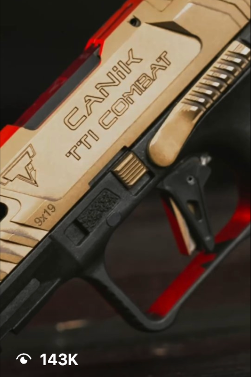
143K Views on Instagram
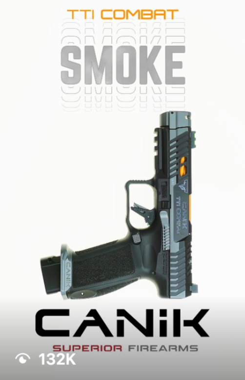
132K Views on Instagram

115K Views on Instagram

31.5K Views on Instagram
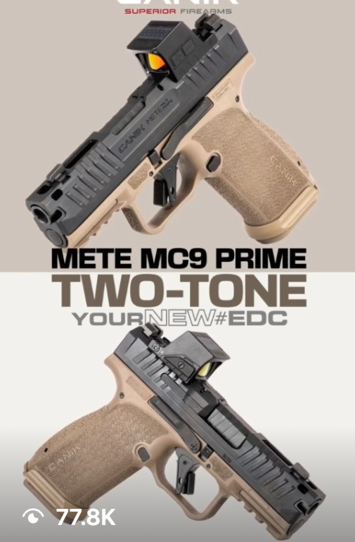
77.8K Views on Instagram

29.2K Views on Instagram

11.8K Views on Instagram

25.8K Views on Instagram
WEBSITE UI/UX CASE STUDY
BEFORE (Old Design) - the previous pages provided detailed product and company information but lacked a clear visual hierarchy and emotional connection to the brand’s precision-driven identity.

BEFORE (Old Design) - photography lacked visual details, colors are off, font choice is blocky and layout is cluttered without “breathing room”

BEFORE (Old Design) - photography lacked visual details, colors are off, font choice doesn’t match visuals with too much emphasis on “smoke” aspect instead of focusing on the product.

BEFORE (Old Design) - Main visual too large. You have to scroll further down to see selection of models. Photography is clear and sharp, but focuses too much on the product and not on the emotional connection of clientele.
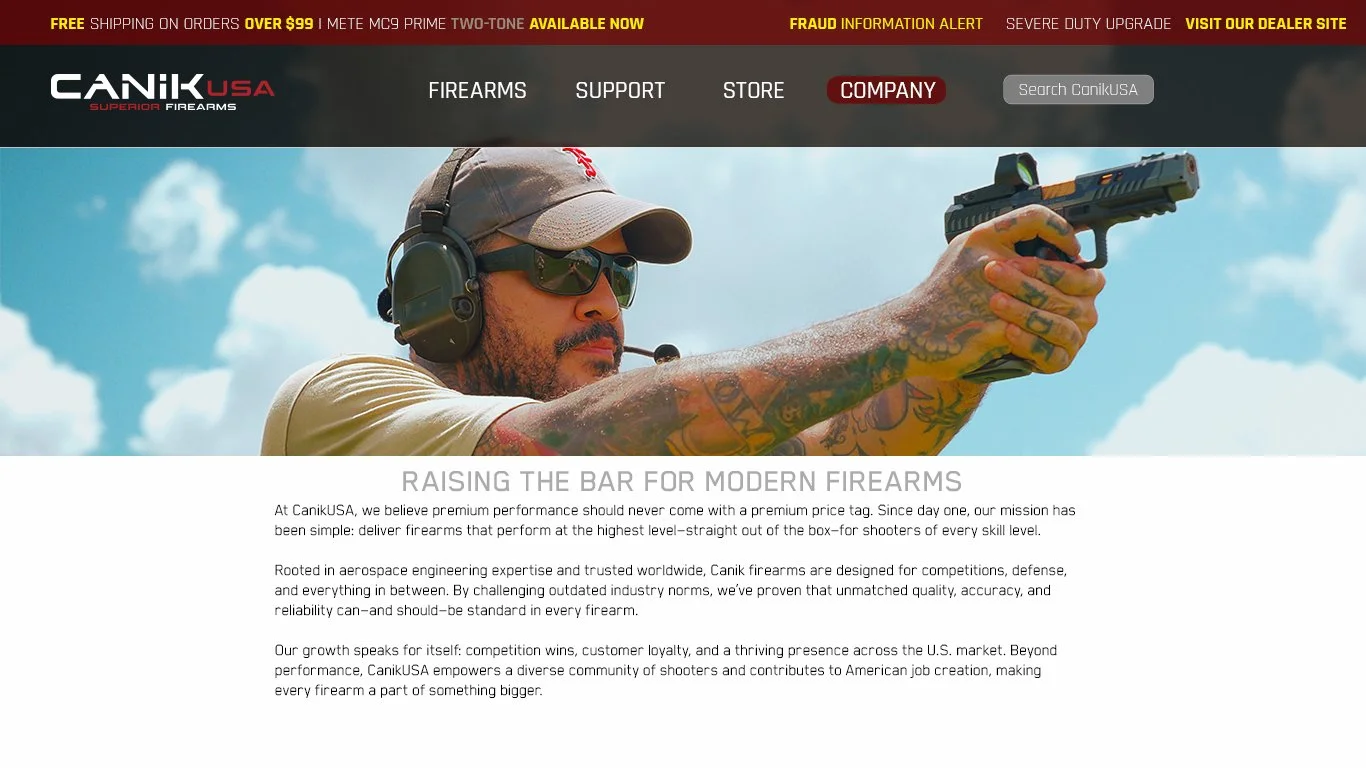
AFTER (Redesign)- Redesign focuses on modernizing the layout, simplifying navigation, and introducing visual storytelling that reflects Canik’s craftsmanship and innovation. 3 specific choices were made: Align visuals with brand tone, rewrite story to emotionally hook customer and modernize font choices to be consistant throughout.
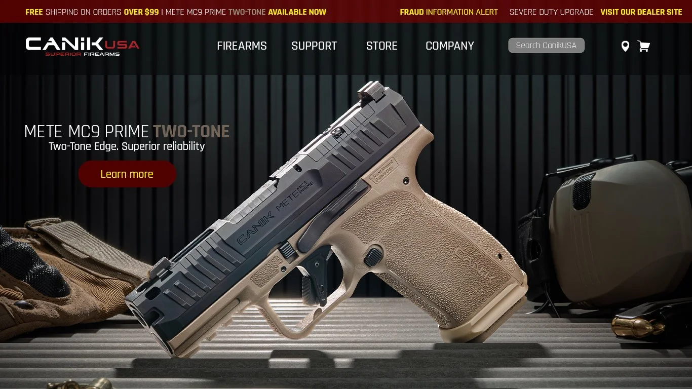
AFTER (Redesign)- I focus on sharp visuals: photography is tack sharp with clear layout intention. Font choice is modern and spaced correctly with a clear call to action.

AFTER (Redesign)- My new redesign focuses on sharp visuals: photography is tack sharp with clear layout intention. Font choice is modern with consistant Headline and tagline with a clear call to action.
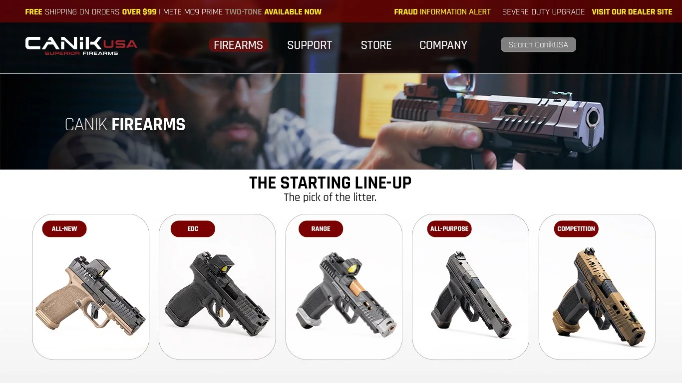
AFTER (Redesign)- My new redesign focuses on target audience connection with clear choice models to choose from without having to scroll downward. Firearm choices are clearly identified to easily navigate between firearm preference.